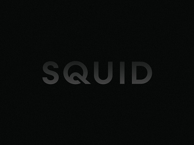
Squid Wordmark
Agency Squid recently went through a bit of a rebrand. We landed on a simplified wordmark that leveraged the playfulness and interest of the "Q". The Q by its very nature has an inherent tentacle quality. By modifying it slightly we were able to elevate that quality while also creating slightly more visual interest.
More by Adam Ramerth View profile
Like
