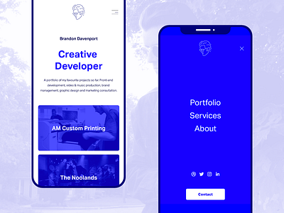
Personal Portfolio / Mobile
I wanted to take a mobile-first approach with my new portfolio website. The goal was to keep things lightweight, but also have each portfolio item open up into a big story with lots of insight about every project and have its own vibe. The site had to fall away when needed and allow the content to rule the experience completely.
The overall aesthetic was to take the fundamentals of the classic internet and embrace them instead of hiding from them. My brand incorporates the dreaded #0000FF blue in a fresh way and I wanted to celebrate the basics!
It's live here: itsbrandond.com
Feedback welcome! I'm planning on officially launching the website before the end of the month!
More by Brandon Davenport View profile
Like

