Swiss Netball
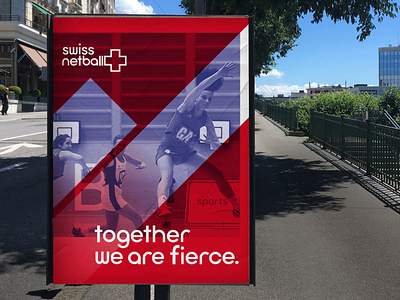


Swiss Netball, the national netball association of Switzerland, launched in 2009 with an aim of empowering women through netball. In 2014, they approached me to create a brand identity that reflected these values. The brand centres around the way players work together and support each other on the court, reflecting the supportive environment of Swiss Netball. However, I still wanted to capture the strength and athleticism of the women who play, using dynamic imagery to inspire others.
The logo features the swiss cross, which becomes a dynamic graphic device as the 'l's in Netball, create the sense of it being in motion.
The typeface I designed for this brand, was inspired by the fluid motion of the players on the court. I wanted rounded letters to reflect this and so based the typeface around a circle. The geometric style was also a nod to their Swiss heritage, whilst retaining a modern feel.
The team kit design aimed to reflect the importance of teamwork with the sport and also the organisation. The design features the moving cross graphic wrapping around the dress, creating a bold and dynamic graphic. There were then two versions created with the cross facing opposite ways, meaning that when players stood next to each other the entire cross became visible.