Limonette Typeface Poster
Poster for the Limonette Typeface.
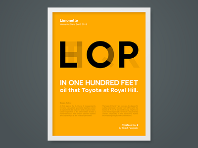
At first glance, the C, O and Q independently hint at a calculated, geometric typeface which is expected to be objective and unopinionated. Closer inspection of the other letters reveals a humanist touch. This tension between opinion and objectivity is at the heart of Limonette.
The bars of H and T are concave, the base of L subtly widens as it moves from left to right, the bowls of P and R exceed the cap height and curve more organically. Terminals are generally uneven, especially in the ascenders, further informalizing the geometric letterforms.
