CCP Printing Press | Corporate Branding
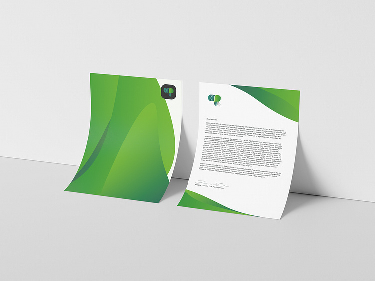
The creative process for CCP’s logo turned out to be a bit challenging than we have expected. (We love challenges! 🤩 We’re not complaining lol). It started with brainstorming and analyzing the client’s vision of a new symbol. They wanted a new brand sign and this was expected to be fresher still simple with abstract elements. In addition, the client asked to keep a green color palette as it correlates with their vision as a company. The core values we have incorporated into this new logo of CCP are: - Timeless - Harmony - Reliability — We're available for new projects! Drop us a line at info@threedesignlab.com If you want to see more of our designs, you can visit us on our Behance profile.
Behance: https://www.behance.net/threedesignlab Instagram: https://www.instagram.com/threedesignlab/
