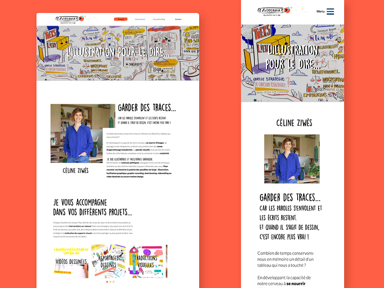
Homepage - A illustrator's Website | UX Design, web design
The design of the website had to remain simple, original but also highlight the artisanal side, the handmade. However, the search for an artisanal and original aspect should not be too marked to facilitate navigation. By choosing a simple and uncluttered look, I knew that the website would put more emphasis on the work for this illustrator with a very colorful style. Stay tuned! To see all my project : https://daviddaumer.com/zedegrafik/
More by David Daumer View profile
Like
