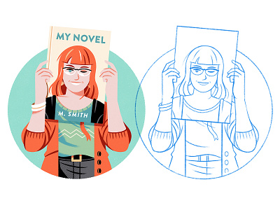
My Novel
This illustration was created with a double objective. It illustrates a Medium article on "Myths Around What a Book Cover Should Look Like" and at the same time, it will help illustrate some points in my next Skillshare class to be published in November.
A class on typography for illustrators that I hope will help artists with no experience using typography. It will offer tips to integrate it into their illustrations appropriately, as well as others more oriented to exploring typography as a graphic/plastic resource.
More by Raúl Gil View profile
Like

