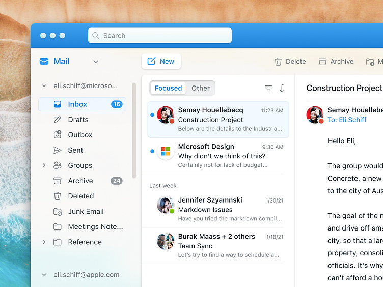
Microsoft Outlook for macOS Big Sur
See the before and after for Outlook from the 2014 Mac BU version of Outlook to the 2020 Big Sur Microsoft redesign, to my own version: https://bit.ly/37lswqm See the @2x : https://bit.ly/34aP3E1
These will help in understanding the notes below.
Since I redesigned the Microsoft Teams app last month to fit macOS Big Sur, I decided it was time to take a crack at Microsoft’s Outlook for Big Sur.
Just under a month ago, Microsoft released their upcoming version of Outlook for Big Sur, and to say it was a wreck would be an understatement.
It tried to establish a more light-feeling, less dense aesthetic, which is what Apple has prescribed in Big Sur. But it failed horribly.
The whole UI lacks any sense of hierarchy. There are tons of arbitrary-seeming text-sizing decisions. The least important elements in the UI are the most heavily-treated. Consider how bold the blue “New Message” button is, and how unnecessary this is.
The search bar takes up 3/4 of the toolbar’s visible space. The sidebar is arbitrarily big, taking away precious space from the content columns. The card UI involved separate cards for each section, taking away more precious space from being used. And worse yet, some cards snap to the bottom of the window, while others have margin around all sides. And other cards snap to the side of the window, but not the bottom. Zero consistency.
Scrolling the left tree navigation sidebar was completely strange. There was no sense of physical dimension between the top of the sidebar’s scrolling area and the content above it, so there are weird masking issues because no one cared to think about where the text goes when it scrolls under (?) another section, like the top toolbar, as well as the bottom tabbed icons.
Then to top it off, Microsoft made the sidebar collapsable as a fix for the ludicrous amount of columns they shoved into the app, and allowed users to collapse the sidebar to make the rest of the columns readable. But the sidebar is clearly important enough to be always persistent. This isn’t an iPad app, despite Apple trying to make macOS into iOS.
Translucency in a background (blurred or not) can be effectively done, so long as you actually test it on a variety of backgrounds and make the opacity sufficiently high—something Apple and Microsoft routinely refuse to do. But both companies totally care about accessibility and inclusion, and therefore the A11y Cartel gives them a stamp of approval.
Microsoft did introduce some unique new pieces of functionality, like hoverable dropdowns, which remove the need for an extra click. But then they failed to employ them in the most useful area, the tool switcher (Mail, Calendars, Contacts), and instead opted for a persistent icon menu. What if we use the hoverable dropdowns there—that would clean things up quite well and remove the need for the icon tab bar.
And lest I forget, the alignments of the Outlook release are nonexistent, when there are some easy and clever solutions available.
For all of these issues and more, my version of the UI has a fix.
The truth is, there’s nothing preventing us from adopting contemporary sensibilities around the usage of space, and even drawing on the print-design motifs and ideals that are rightly or wrongly popular today. But there does seem to be something stopping designers from doing this well. It’s getting to the point where even I have a problem with it.
