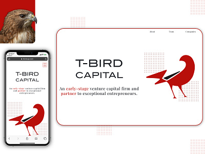
T-Bird Capital
Currently available on www.tbirdcap.com.
When building this site, I worked closely with the founder of T-Bird Capital to ensure that the firm's digital presence retained a formal yet simplistic aesthetic.
With such an easy visual reference, the bird, I was able to come up with a design revolving around the firm logo's maroon red. I even created additional potential landing pages with actual bird imagery (required some Photoshop work); you can see one that didn't make the final cut on the image's top-left corner.
An interesting challenge was finding a uniform design to display all of T-Bird's investment and advisory positions. In the end, I went for a simple table-style design showing each company's logo.
Graphics and overall design created by me via Sketch. Developed and deployed by me via React.
As I am publishing my work both as a portfolio but also for my own learning experience, I have to acknowledge the weakest part of this design–the mobile navbar. It looks like I made it in Microsoft Paint–but hey, another program I can add to my resume right?.
