KetamineMD
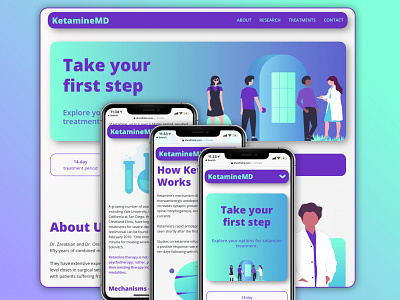
For KetamineMD, the practice's doctors and I agreed on the website being a combination of comforting and appealing with all of the information needed for potential patients. We wanted the colors to feel both calming and exciting, almost as if reflecting the joy one might feel from the benefits of properly addressing mental healthcare. Considering that ketamine use in treatment-resistant depression is not as widely-adopted, this website had to carry the feeling of bringing something new, cutting-edge, exciting, and most importantly, beneficial to patients.
Additionally, it was a great experiment for me to play around with the use of gradients in web/app design.
This was initially designed via Sketch. Shoutout to Coolors.co for helping me find a great color palette! The final website was developed by me via React (HTML/CSS/JS).
