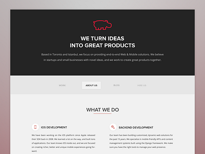
Hipo Web Dark
While editing the about us page I went for a darker look for our header. Cehck out the attachment for real pixels and to get a better feel for the website.
Do you think dark is the way to go?
More by Kaan Eryilmaz View profile
Like

