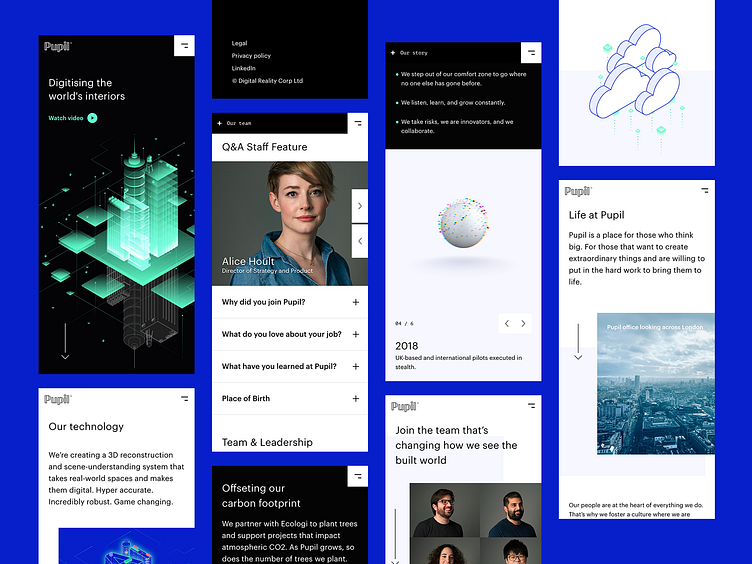
Pupil – Mobile Web Layouts
Hey friends,
More Pupil sharings here. These are some of the layout snapshots from Pupil's corporate website. The website evolved in a direction where I actually started loving it especially with the illustrations and the employee headshots. They add so much value to the design alongside the layout, spacing, and of course the typography. I like the Graphik family a lot. They serve the purpose very nicely. Although Google has many beautiful modern font options, coming up with more unified typography makes everything even more delightful.
Hope this is a good piece for the eyes. Thanks!
More by Pupil View profile
Like
