DonutShoes Branding + Album Art
I had the pleasure of decking out another great friend of mine in the chiptune scene, DonutShoes, with some cohesive branding, an official logo, and album art for his most recent EP.
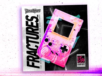
His aesthetic overall is somewhere at the intersection of ska, '80s neon, '90s cartoon title splash typography, and a pink frosted sprinkled donut. To get there, I deconstructed a photo of an empty Game Boy shell (that he sent me as inspo) and stitched it back together in a reference to the system's original box art.
The "Farm Boy" label at the bottom, apart from being part of the box art appropriation, is both a portrait of DonutShoes himself and a reference to his work as a farmer, specifically his melon-planting Twitter saga, which was must-see internet, imo.
You can listen to this EP and more at https://donutshoes.bandcamp.com/ and you can catch up on all his farm shenanigans on Twitter @DonutShoes.