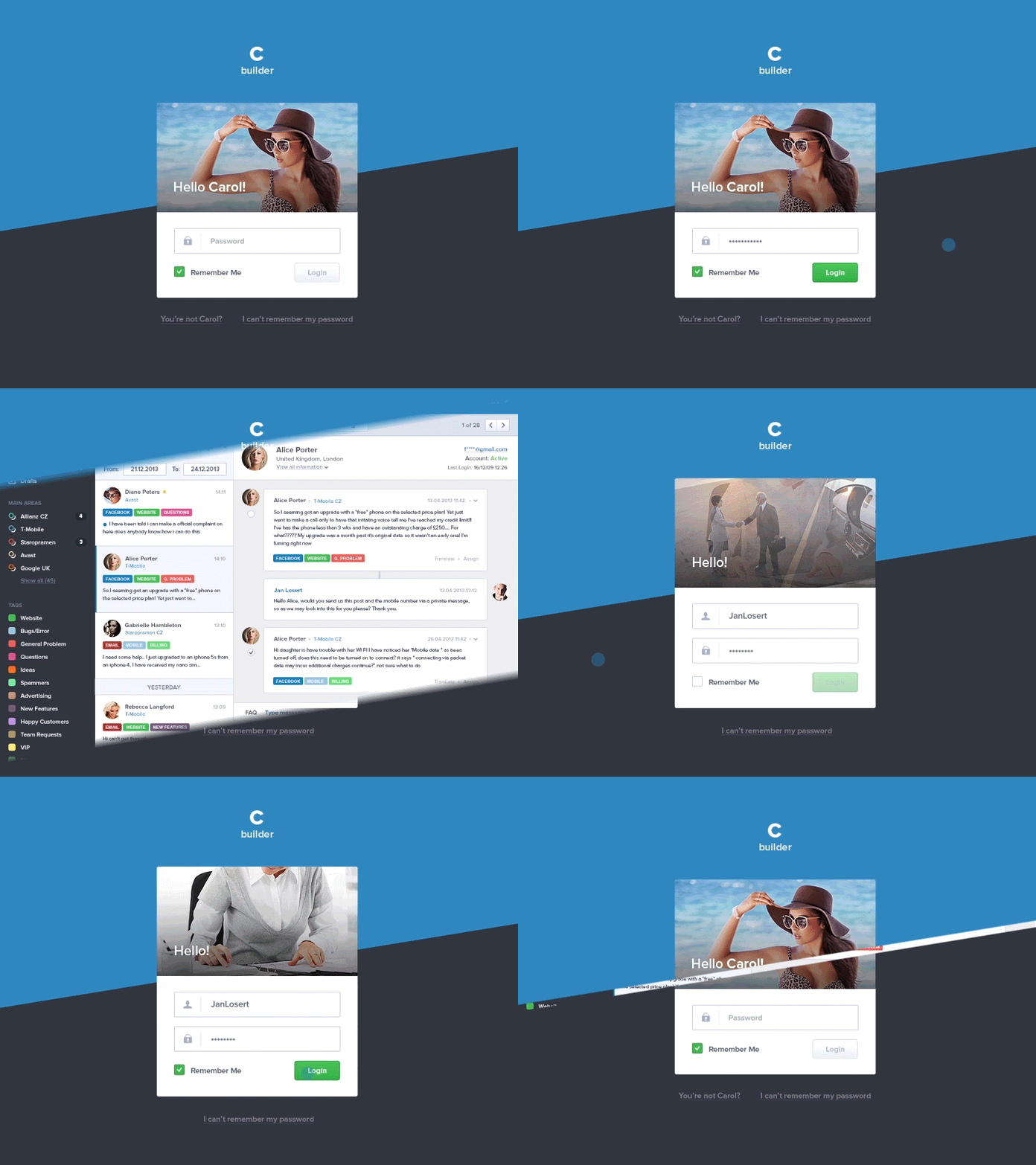
Customer Care Login Flow
Hi guys,
After my portfolio I’m back with a Customer Care project. This is only a small example how would a login work for users that are regularly logging into the system from their computer and how it would look like for new users. I’ve uploaded the whole case study on Behance with the example of most of the main screens and with a description how the project work and how it’s different from other customer care systems.
Taking into account the fact that I’m a novice on Behance, I’ll be glad for any support!
I’m really curious about what you’ll say about this work and I’ll be glad for any feedback. I’ve tried my best to show the most about how I’ve been thinking while solving projects like this for the past two years.
Check Here Full Project Overview - http://www.behance.net/gallery/Customer-Care-UI-User-Experience/14852505
--------
Learn More About my Design Process - https://medium.com/sketch-app-sources/26-steps-of-product-dashboard-design-c97af84c4146#.nfjs2vwdr
