Branding Belgisch nationaal roeiteam

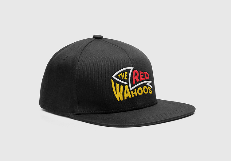


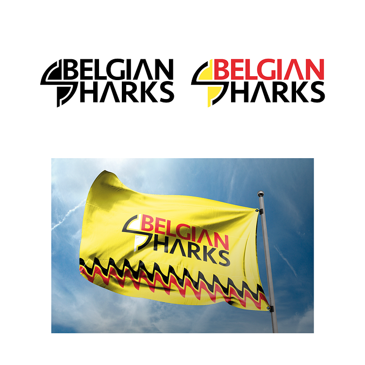
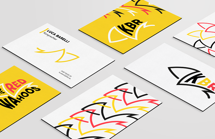


Voor deze opdracht moesten we met 3 ontwerpers een naam, logo en roeipakje verzinnen en ontwerpen voor het Belgisch nationaal roeiteam voor de Olympische Spelen in Tokio 2020. We hadden elk een naam voorgesteld en deze ook uitgewerkt. Ik had "The Red Wahoos". Een wahoo is een vis en ik heb deze samen met een deel van de roeiboot verwerkt in het logo. Het logo is dynamisch geworden omdat het voor een sport is. Uiteindelijk was de klant niet overtuigd van de 3 voorgestelde namen en hadden ze zelf een naam uitgekozen. Dit is dan "Belgian Sharks" geworden. Het illustratief gedeelte van het logo stelt de roeiriemen (geel) en de haaienvinnen (zwart) voor. Ook stelt het de S van "Sharks" voor.
For this assignment, I worked together with 2 other designers, we had to come up with and design a name, logo and rowing suit for the Belgian national rowing team for the Olympic Games in Tokyo 2020. We each proposed a name and worked it out. I had "The Red Wahoos". A wahoo is a fish and I incorporated it into the logo along with part of the rowboat. The logo is dynamic because it is for a sport. Eventually the client was not convinced of the 3 proposed names and had chosen one themselves. The name they chose was "Belgian Sharks". The illustrative part of the logo represents the oars (yellow) and the shark fins (black). It also represents the first letter S of "Sharks"
