LinkedIn app redesign concept pt. 2
Some more bits and pieces from my take on LinkedIn.
From previous shot:
"If you don't like it - fix it" is one of the very few life rules I try to follow as best as I can. And I really don't like LinkedIn interface and how it's seemingly stuck in time. Job market is constantly evolving, but the main platform we use for recruiting and connecting with professionals feels so outdated.
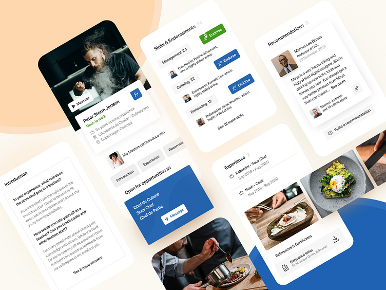
With this concept design I tried to set the person in focus. I greatly enlarged profile picture as well as added "profile video". I have added navigation in case recruiter is interested in something specific. Furthermore, as so many people are affected by the pandemic, I have set "Open to work" in much greater focus. I also tried to improve the experience for recruiters by letting professionals define what roles are their interested in.
I have also tried to rethink "Summary" section. Instead of writing about themselves people would be able to answer some questions defined by recruiters and industry leaders. That way screening and matching process would be easier too.
It's impossible to design a "one fits all" solution for a community of millions, but I think LinkedIn isn't even trying.
If you have thoughts about LinkedIn I would love to hear them in the comments.

