DH & JS Trading Iconography
The guys at DH & JS trading asked me to create a brand that would stand out from the often cold and disconnected content seen within automotive retail.
With involvement in a bread and butter industry what you see is often what you get. It quickly became clear there was room for an injection of colour, personality and customer connection.
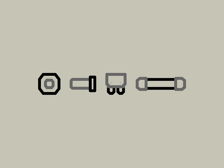
The brand strategy centred itself around a mechanical, connective logotype that transformed into a suite of icons that spoke of what the company sold. Creating a solid connection between the brand and its clients.
