Tobacco Rd Logo
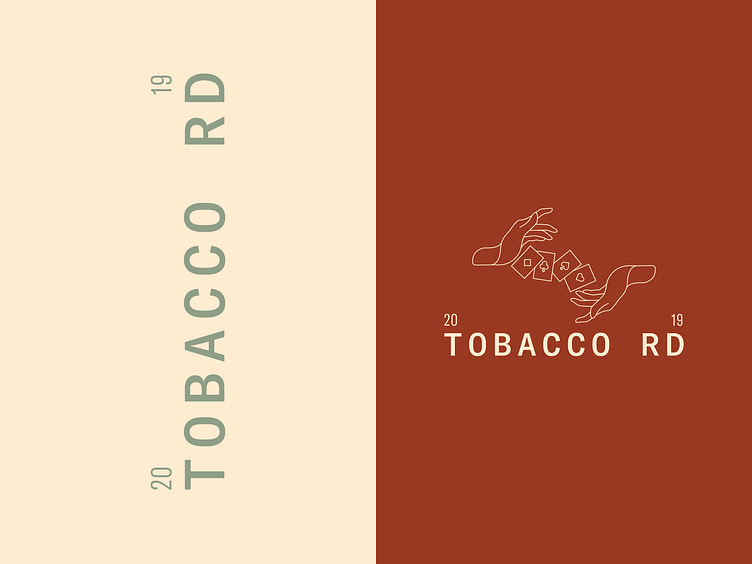
Tobacco Rd is a brand that emerges from the thick smoke of 1920s speakeasies. A brand built around deception talks about the trickery that unfolded within such establishments.
My logotype nods towards metal pressed street signs and can sit solo or pair up with the brand's adaptable hand asset. An asset that visualises the trickery of the prohibition period. From the crafting of bootleg liquor to ideas of deception through sleight of hand card tricks.
