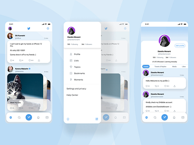
Twitter Redesign - Mobile Version
Hello!
Today I would like to share shot of my twitter redesign that I create for a technical test for UI Designer position.
The idea of this design is that I wanted a simple, clean, and sleek UI, since I really like that kind of look (but still user friendly).
I use text bubble to distinguish between tweets and use carousel for photos because I thought it would look nicer instead of photos placed side by side.
I hope you can give me some feedbacks, and also i'm open for discussion on how to improve myself.
Thank you!
More by Diandra Monami View profile
Like
