Lustre The Musuem of Light Ad

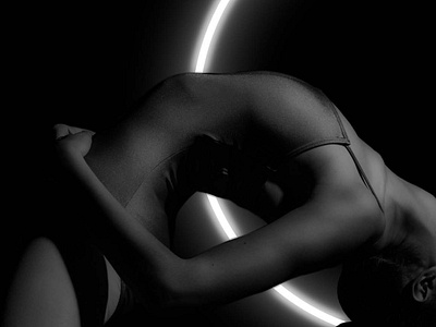
I chose to focus not on light but on the shadow it casts. I took a familiar shape and made it interesting but also simplistic to make it memorable. Sans serif fonts were used to keep the logo modern and clean. The high contrast between black and white is repeated throughout the CI to create the feel of hard light which is juxtaposed and softened by delicate gradients creating the illusion of shadows being casted.