Design Concept
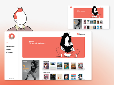

A redesign of Issuu's explore page.
The goal is to help users navigate multifaceted experiences through human-centered design by creating features that cater to human needs instead of only focusing on customer feedback. As Norman says: “Technology changes the way we do things, but fundamental needs remain unchanged.” I achieved this by allocating Issuu’s services into 3 key components: discover, read, and create.
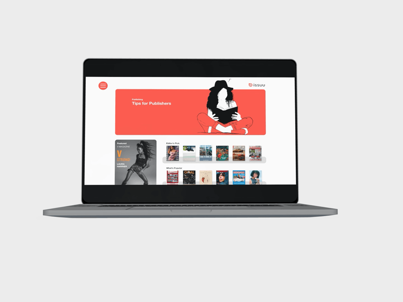
I designed this page to convey hierarchy and communicate priority. Issuu is both a publishing and reading platform. It became apparent after desk research that its primary function is intuitive publishing. Therefore, I used most of the “screen real-estate” (masthead) to aid the publishing-user in using this service. For the reader-user, I provided a featured magazine and gave that secondary importance.
This design was created to complement existing features. If I were to go further, I would design experiences separately geared towards publishers and readers. This would be achieved through storyboarding. The storyboards could be created through desk research, assumption mapping, and empathy mapping.
Designing for the publisher and the reader I could create 2 MVPs, which I would begin interweaving iteratively through focus group interviews and a/b testing. Through this process, I would create an optimal experience that benefited both users.
I would also like to point out that priority in content can also be personalized through machine learning using data on content accessed. As a result, many of the features and components could be renamed, move to other pages, or removed entirely. In other words, user interactions would create a more personalized experience.