Real estate website concept
Good Morning! ☀️ New website concept waiting for you!
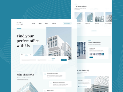
A website for a real estate agency that deals with searching for real estate (office buildings and offices) for sale or rent, acts as an intermediary in sales, offers its own
real estate 🏢.
The choice of color, using shades of blue 🎨, shows the company's professionalism,
builds a positive image and provides a sense of order and harmony. The design is very minimalist and a bit cool but still professional. A lot of empty space gives freshness and breath to the design.
Pictures selected from a unified collection created by one photographer give consistency to the whole project and match the rest of the aesthetic 🏙.
The search engine in the header brings the very essence of the agency's operations to the fore. We immediately move on to what is most important, i.e. searching for the right property
in a suitable location, and at the right price.
A small number of sections means that the user is not overloaded with unnecessary information.
Customer feedback states that the website seems real, is an effective tool for building positive relationships between the agency and customers and inspires trust 🙌🏼.
Art direct by: https://dribbble.com/romee


