Le Monde Courrier + Parisine
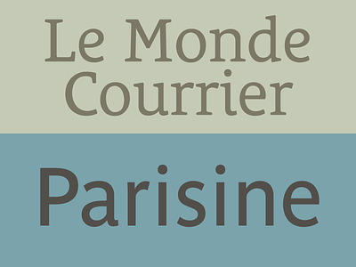

Pairing typefaces well bring always a nice typographic touch to any graphic design project? Le Monde Courrier (feauring the rounded e or the common shape) is a low contrast, rounded slab. Parisine is an ultra legible typeface originally designed for the Paris public transports. Together, they simply works beautifully.
http://typofonderie.com/fonts/parisine-family http://typofonderie.com/fonts/le-monde-courrier-family/