Top Up Vouchers | George Store
Hi people!
I am happy to share with you a part of how the products in George Store (a virtual store where you can contract or buy Erste Bank's products) were created, or what we had in mind when we developed them, which are now presented to the public through George, the pan-European platform that transforms banking with digital g(e)orgeousness.
As a UX/UI designer I am honored to be a part of a great project and I am particularly grateful I had the opportunuty to learn, colaborate and strive for better with my colleages from the Direct Channels Division in Erste Bank Croatia. I would especially like to thank Luka Savić and Vanja Đurinec, the more experienced guys, for direction and design decisions and to all the participants and colleagues who directly or indirectly influenced products development. You guys rock! 🙂
Finally, let's get to the point 😉
TOP UP VOUCHERS #CaseStudy
The goal was to enable our users to buy mobile top-ups through George Store, Erste Bank’s new online store.
BUYING TOP UP VOUCHERS IS A PRIORITY
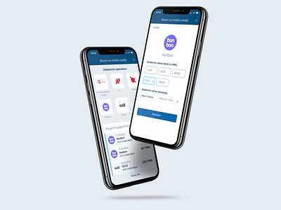
More than 90% of users who access Top Up Vouchers are going to buy a voucher and then top up their account. A seemingly very simple flow in the existing AS IS state (Q3/2019) shows and puts the history of purchased vouchers in the first place (which takes up to 80% of the screen). Also the Add/buy button could be more visible.
THE EXISTING PROCESS "HIDES" DATA
The existing process of buying vouchers uses/displays a sequence of drop-down menus which are not very helpful in a situation where there is a limited (small) number of options that could easily be displayed all at once and be selectable immediately. The solution that emerged was to use associations. Also, the information of previously purchased vouchers will still be available where the user expects it, but the emphasis now is on what the customer comes up with in most cases, and that is buying a voucher.
WE DISCARD THE USE OF STEPS. EVERYTHING IS VISIBLE ON ONE SCREEN
We have retained existing functionalities, and added new ones; we made it possible for the user to activate the top up, after successful purchase, by calling the native app "Phone" on the device. We enabled the voucher to be shared and enabled the user to re-purchase the voucher from the voucher history. Using associations and immediately displaying data has greatly reduced the time required to buy a voucher which can now be made, literally, in three clicks (operator selection, voucher price, buy voucher button) in the new flow. Take a look on the new design: no more steps, everything is on one screen. The process is fluid, fast and intuitive.
See you in the Next Chapter! 🙂

