Tokyo Paralympics 2020 Mascot Design

Paralympics Mascot Profile
Creative Idea:
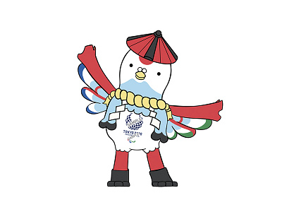
- A bird spirit inhabiting temple gate, a traditional symbol. Used the literal kanji meaning of the gate (鳥居) as an inspiration for the mascot. Used a hybrid of pigeon (鳩) and Red-crowned crane (たんちょう) for its design. They are chosen with the intention to symbolize paralympics here as a comfortable and optimal place for athletes to bring the best out of them without worry.
- Wings symbolize inclusion. The inner side of the wings shows view of mountains and the ocean in the day. The color combination with its body frame also syncs with paralympics classic symbol. There is also a motif of Mt. Fuji under its peck, designed to further emphasize Japan’s natural charms. The adaptation of both nature motifs and man-made traditional structure is done to show Japan’s everlasting harmony with nature.
- The gate is made out of wood, which is a widely used architecture material that strongly withstands earthquakes (resilience).
- Colored using a color palette of traditional Japanese colors.
Character Features:
- This mascot loves to challenge itself to new things. It always wears its heavy shoes made out of stone by its friend to run, do sports, and even to fly! It likes to set new target records to keep itself inspired.
- The mascot has a straw hat (笠) designed similar to a pagoda roof. Protects itself in the days of rough weather during training. It is also installed with a communication antenna to stay in touch with its friend (the other mascot)
- Always self-driven, and always does its best in anything.