Booking a flight / Application

Today I would like to show you a small piece of Booking Flight Application. ✈️
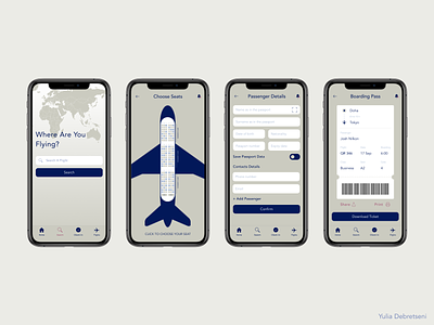
Before redesigning the app, most of the screens were cluttered and flows are too long and too difficult for most users, also screens with boring and dull colors that are hard to see especially for millennials. The overall interface has been deeply optimized and designed based on its functionality, improving the overall unique interactive experience. The purpose was to make screens clean and simple for usability.
One of the assumptions was to redesign the information architecture of the app. Thanks to that users will be able to search flights faster or check price analytics to choose the best date. While creating a seamless and effective User Experience I focused on increasing simplicity and user satisfaction.
As a result, I summed up the common design and functionality trends incorporating best practices and unique approaches. The purpose of the app was to create the design of a simple and easy-to-use interface for everyone.
Please check the full version of the attachment.
Check out app on Behance
Thanks for watching! Don’t forget to press “L” if you like it! ♥️