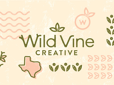
Wild Vine Creative
The intention of this project was to describe who I am and what I do with a new name AND visual design too. Below are the ways I’ve incorporated meaning into this work:
🌿 Natural elements like small leaves, soft waves, round/organic shapes, and the color green emphasize my passion for organic food and nature-based subjects in all of my work.
✏️ Additionally, the texture in my branding represents the care and unique hand-made quality of my craft! These natural imperfect aspects also symbolize authenticity, something I value in my creative pursuits and life journey overall.
🌸 The color pink represents positivity and how I strive to work with others with an energy that is understanding yet honest.
More by Sarah Acevedo View profile
Like
