Landing Page 1
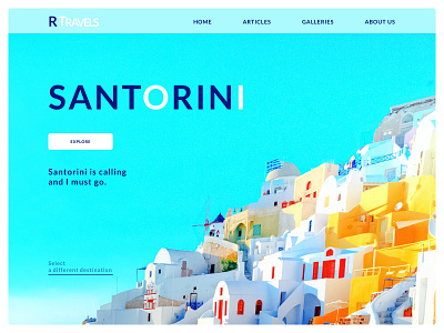
This is my version of creating a landing page for a travel company, specifically for someone trying to visit Santorini. I tried to use a bright-colored picture of Santorini as the main image so that my color scheme can be taken from the image itself, creating a lot of consistency. I also tried to keep things minimalistic and only include things that I felt were necessary for the viewer (like the explore button and the "select a different destination" line).
I know that there's always something I can improve on in my designs so any constructive criticism is appreciated!
#dailyUI003
More by Rohit Tota View profile
Like
