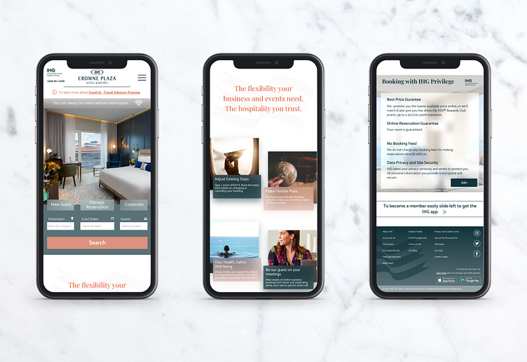
Crowne Plaza Mobile Re-design
The first design which is quite exciting for me :) I've checked many websites on brief and selected this idea for redesigning. I used Milanote which is quite useful, I think. Main target is to explore a new approach with exciting young business travelers. I was once for 5 years :), from there I definitely know that as a young traveler you never know how to get exhausted, so the thing you see is mostly sunset within inappropriate travel time :) The color palette is coming from sun and sky shades. Two main typography I had, one is highlighting premium service, second is easy to read, fun and energetic such as travelers. That's it. I'd love to hear your feedback :) Thanks M
More by Melda Başöz View profile
Like
