Mailbird Redesign
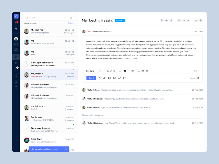

Hey Dribbblers! Recently, I've redesigned the Mailbird application from 2012.
The goal was to make a more understandable and modern user interface while keeping it simple.
How did I do that? - Improved the hierarchy of the sidebar so that the features are easier to recognise and understand. - Improved the overall hierarchy of the application to highlight the more important elements. - Implemented richer colours to create more contrast. - Changed the font to a more friendly and round one to give it a more modern look. - Implemented more consistent iconography. - Added more margin and padding to give it more breathing room. - Aligned elements to make it less chaotic and more organised.
____
Feel free to share me your feedback and press "L" if you like it 🙂