Logistics App UI Components
Hello people!
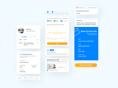
I’ve put together some UI components from the logistics app I shared in a previous post.
The app’s target audience is Chinese-speaking people(either residing in China or Australia), so the default language of the app is Chinese.
For the design to be better understood by you, I’ve attempted to translated some components in English. But you will see from this post, that two distinctly different languages pose a challenge for UI layout consistency.
We as designers need to be aware of this when we design a product that supports multiple language options.
Designer: me
Tool: Figma
Let me know what you think. Welcome to discuss this topic with me, or any other topic really.
Give it a Like if you think it's good.
If you have a project idea, feel free to DM or email me: michelle.zhu.design@gmail.com
Welcome to connect with me via Instagram.
Stay safe,
Michelle


