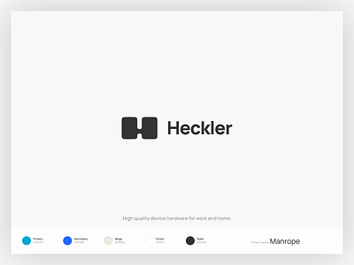
Heckler Branding
As a part of the Heckler website design, I also revisited their logo and color scheme.
Instead of an overhaul I made some slight changes to the typography and added a more vibrant blue to be used in digital contexts.
Press "L" if you like it!
I’m a Southern California based designer with experience building brands and products for companies ranging from early-stage startups to Fortune 100 companies. Currently building financial products at Square.
More by Soren Iverson View profile
Like
