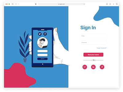
Color Constrast form 1 - Sign In
This time I am bringing a web work here with a very common pattern I use when I design for the sign in and sign up page of some web projects, which is putting some illustrations vertically besides the form with some colour contrasts. This can makes the whole interface more vivid, and also better for the frontend responsiveness implementation.
But this work is actually inspired by the illustration you see here, I am always trying to make my work to have some kinds of connectivity not just between the screens (like the onboarding screens from my previous works which you can check it out), but also the components within the same screen like here, and I found this illustration can perfectly do that, which really gives the whole screen a special visual experience.
This very special illustration comes from Freepik Stories, the illustration from the sign up page in the next shot is from here as well.
Good night from UTC+8.
