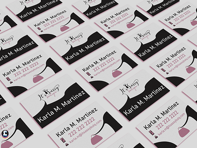
It's Sassy Boutique Business Card
I decided to use a front-page ink draw technique to create a nice separation between name and business name. This gives the flexibility to change the name for other employees using the same business card design. as well as quickly ability to change iconography and the hand bad illustration.
On the front page (one without contact details) , I decided to extend the letter to give it an ink flow feel and unique connection to the wordmark and logo. On the reverse, I repeated the name as not always you flip the business card. It's nothing more frustrating than flipping the business card to save the phone number in contacts and the name is not on the same side of it, at least for me.
On the reverse, I decided to use the same shape motif from the front in a gesture. I created a purse and a "hand" that gives a suggestion that there is a service provided by the person that has contact detail on the card. It's kind of like a hand in handling gesture. The logotype was provided by the Employer. No changes were made to it.
This is a contest commission.
https://www.freelancer.co.uk/contest/Boutique-Business-Cards-1831751-byentry-43494516
