Not-Hectic Business Cards
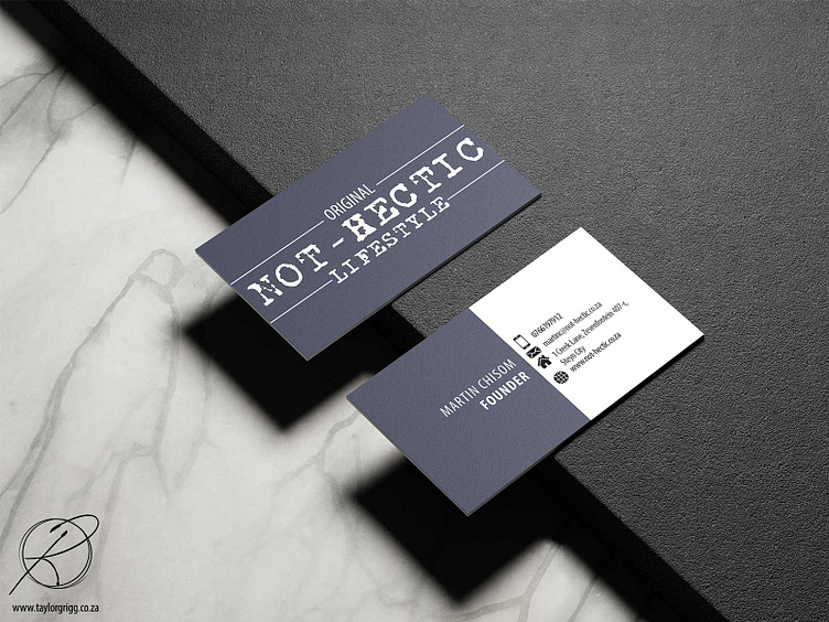
The (Brief) Meeting: My brief meeting with Martin and his co-founder, Lusanda was very enjoyable. The couple did not have an idea on what direction they wanted to go in for their Logo, so creative freedom was mine for the taking! During the meeting, Martin pulled out an e-cigarette of sorts. He stated that the colour of the charging box was the colour he wanted for his Logo. Thankfully, I had recently found a Mobile App that could take the photo of an object and then provide you with the HEX Codes and RBG Codes of the object. The colour Martin was so infatuated with was #414455. The last bit of information the Client wanted to make clear was that he enjoyed the look of a stamp or brand (as in, heating up metal to brand leather) but that he wanted the style of the logo to be similar to that of Levi, Guess, and other big-name apparel brands. This was to emphasize the mission of their newly founded company: “You don’t need to be rich to look like a million bucks”.
First Drafts: I created 5 concepts for Martin to choose from. For these drafts I tried to focus on bringing in a modern design while using a slightly different style for each one. This was so I could try and ascertain if Martin wanted an Elegant, high-class look versus a Grunge/alternative look or even a combination of the two. Martin loved the grunge font that I had used in one of the digitized concepts and he insisted that we use it.
Second Drafts: The last thing Martin wanted to discuss was some word-play. How would the Logo look if we used different words that still captured the essence of what his business was about? Some words that were brainstormed was: “Society”, “Culture”, and “State”. Seeing the Logo with different word variations just confirmed that “Lifestyle” was the term Martin wanted to go with and with that, his new Logo was ready.
Conclusion: Although my time working with Not-Hectic was short, I enjoyed the energy that Martin and Lusanda brought to this project. Martin was thrilled with his new Logo and about the fact that I was able to bring in the Stamp aesthetic and colour he wanted. Martin is a Client that I will not soon forget. His work in Interior Design and Fashion made creative conversation very exciting and his ability to speak and understand design jargon made it easy and straight forward to give him the design he wanted without him specifically telling me what he wanted.
Please Note: If you wish to view more about this project, including my original concepts, please head over to my website: www.taylorgrigg.co.za
(Website is currently under maintenance while I finish uploading all design projects and briefs. The site will be live soon. Thank you for your patience)
