Equinix - Cloud Exchange
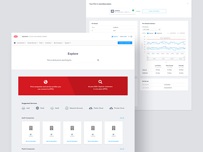
We worked to create a system that would highlight the most important elements, making them easier for users to find. We introduced network topology diagrams that offer clear visual pictures of network setups and allowed our development team to deal with data sets containing over 100,000 pieces of data. This elegant solution integrated with their API to bring meaningful insights, not just more information, to users. With a more user-friendly format for understanding their networks and navigating the portal, Myplanet created a more digestible and enjoyable experience for Equinix users.