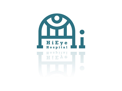
Logo Design For Hi Eye Hospital
1. As you know :) the name of this hospital is HiEye.
If we look at logo we can see an eye which indicates that this is an eye hospital.
2. The eye is confined to bed and the bed is referring to hospital concept.
3. Letter «H» is combined with the bed, and letter «i» looks like a bedstead which can make the bed obvious.
4. It’s like that water is reflecting the image of logo. In this way I wanted to say that by services of this hospital your eyes can sea clear like clearness of water.
5.The reason why I chose this color code was that it could easily give a feeling of health/care services.
More by Hamid Ahmadi View profile
Like
