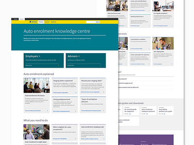
Pension Information UI Design
I created this when I worked at Aviva. This was a page in the business website redesign that I co-lead and was a hub for content to educated customers on auto enrolment and pensions. The clean, modular UI worked well and I created guides around how varying content amounts (i.e. 3 or 9 articles per section) would look so it was adaptable.
More by Hannah Winter View profile
Like
