Pacific Logistics Group Branding
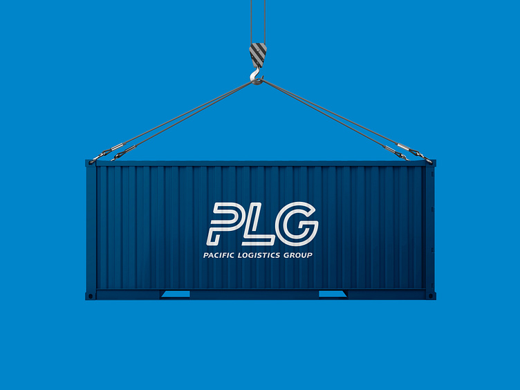
PLG Wordmark The PLG identity is a wordmark formed with a single line for each individual letter, representing the seamless cross-border collaborations and connections that PLG delivers through its multimodal solutions – land, air, and sea. The colour blue sustains the familiarity customers have with the previous brand identity, while the gradient symbolises PLG’s agility and dynamism.
=========== == == == == == == == == == == == View the full project on my website https://harinivenkatesh.com/plg-logistics =========== == == == == == == == == == == == Interested in working with me? I'm open to branding and UX opportunities @ harini.svenkatesh@gmail.com =========== == == == == == == == == == == ==
