WorkingMouse Logo Design

The heart, soul, and centre of our brand identity.
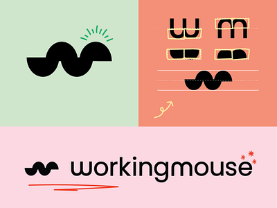
Our WorkingMouse logo was created using a modified version of Poppins Semi Bold.
This type was modified to increase the rounded appearance. The goal was to create a word-mark which would sit well beside illustrations, as well as suggest an air of approachability and modern simplicity.
The lowercase m in the full primary logo was duplicated and turned upside-down to also form the ‘w’ in WorkingMouse. These two letters, side-by-side, were then by iteration transformed into the logo-mark. Although this logo-mark does not explicitly illustrate a mouse, it calls to mind characteristics of one.
