Iron Chef Infographic

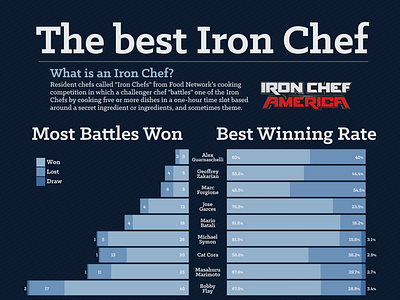
The Best Iron Chef infographic was created for my Infographics and Information Visualization class project. I wanted to represent and showcase what could define the best Iron Chef. I gathered episode data to understand how the information could help determine which Iron Chef is best. Then I created sketches of how I wanted to present the information in the infographic. Afterwards, I used the R programming language and RStudio to create the basic graphs. Then I imported them into Illustrator to refine and polish the graphs and design the final complete print version of the Infographic. An interactive dashboard version was also created using Tableau, where the user has the ability to filter and interact with the data in various ways.