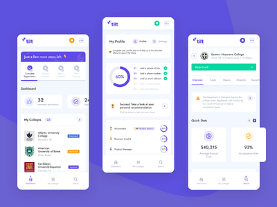
Tilt Education Platform - Mobile
Hey Folks! 👋
Today we want to share another part of Tilt Education Platform. While working on the mobile version of the dashboard we wanted to create an experience similar to the mobile app.
Youngsters spent more time on mobile devices compared to desktops. That’s why our goal was to design an interface that lets users do their tasks on the go. On these screens, you can see the Dashboard with main numbers, profile with task completion rate, and college overview.
Share some love to Glow, press ‘L’ ❤️
More by Glow - UI/UX Design Agency View profile
Like


