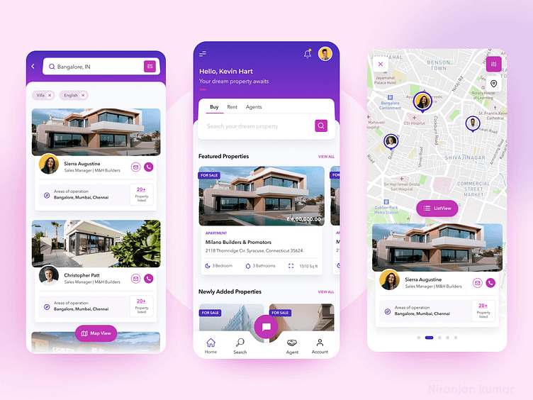
Staylia - Real estate portal app (home/user screens)
Hello Dribbblers!
Here is shot of the project I had worked for an online real estate search portal app that helps connect property owners and tenants, buyers and sellers directly. The client wanted the app to be bright, attractive and standout from the crowd, they were open to try out new features, layout styles and interaction models.
So I focused first on keeping the color palette attractive. Then tried out 15+ layouts & card styles, we finally fixed on using the trapezoid shape for all the major interactions expect buttons, thereby creating a sense of similarity or grouping. Users are allowed see their expected search result in list view or in map view. Map view makes the users to quickly see the list of agent/owners with pictures in their desired location.
You can also check the login flow of the same here - https://dribbble.com/shots/14261321-Staylia-Real-estate-portal-app
Keep following me to see more on how the other screens will look.
Your feedback always keep me on fire to create more stuff 🔥🔥
Stay with me for more cool stuff - Instagram | Facebook | Behance
