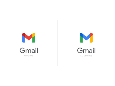
Gmail logo redesign idea
Hi there,
I saw yesterday that Google has redesigned the logos for the Google Workspace. Personally, I really like the way they look in the end result, and it is clear that they are part of the system, the brand. But after analyzing the icons, I realized that I didn't like the design of the Gmail logo compared to the rest of the logos in this family. The idea is that the Gmail logo is dominated by red, while the rest of the logos use red as an accent. Based on this and some small changes in the symbol, I changed the colors in places, and this is what happened.
What do you think about it?
Need help with a logo for your business? I would like to help you!
More by Oleg Coada View profile
Like

