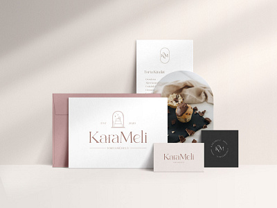
KaraMeli confectionery - Branding
Custom branding for a premium confectionery shop, where cakes and sweets are made in front of the customers.
The word KaraMeli comes from caramel and the name of the confectioner, Melitta.
The logo concept I created focuses on an elegant, clean and timeless look.
The letters were individually customised, the combination of the letters "a" "r" "a" and the arc of the letter "e" gives the logo an exceptional, premium feel. They were made with the same precision, care, and expertise they would expect of themselves when making their cakes.
The soft, wavy shape of the lines evokes the lightness of the creams and the texture of the caramel.
The primary logo - where space allows - can be supplemented with unique line art according to the specific profile (cakes, pastries, coffees).
In this picture (without claiming completeness), I outlined how it would all show as part of an entire brand, along with alternative logos for different sized application areas. (A circular monogram, such as for stickers or social media icons, or a vertical one, for example, on menus.)
