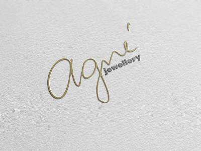
Agne Jewellery Logo Design
Agné is a creative jeweller with multiple ideas for creating unusual designs!
A brief for a logo design was to depict a geometrical object that would remind clients jewellery. The wish was to portray some level of authenticity of Agne's unique handmade work. Client’s request was to use soft colour palette – pale pink and white. When I started on the project, I have encountered a few challenges. One of them was to create a geometric logo, that had to depict client’s work, second it was the colours that were too low in contrast. Working along with the client I have suggested variety of logo examples, however it didn’t match with her jewellery.
Eventually, we decided to take a more traditional approach that we felt represented her work the most. To give a warm and authentic feel to the logo, I have decided to use client's hand written piece and combine it with bold and simple structured font. It made client happy to see that she could contribute to her own logo design which also complemented her jewellery.


