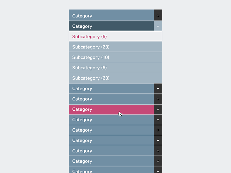
Approved Category Navigation
This is the final accordion nav colors that the client approved. In the layout, the previous one felt too bold to him and took away too much attention from the content. He also wanted to add more blue into the gray, as he found the gray in the previous comp too "dreary." LOL.
Still, I like this approved direction. :)
More by Lea Alcantara View profile
Like
