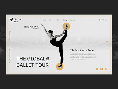
Landing page | The global baller tour | Concept
Hey fellow 👋
The global ballet tour landing page was created to describe the ballet event which would take part in a lot of countries on the Earth.
I used black&white colors and gold color to emphasize elements✨ and create a contrast between graphic and information.
What do you think about this concept? 🤔
Do you like this work and want to make something similar for your landing page/ website / mobile application?
Get in touch with me - 🍀E-mail - a.boichuk.v@gmail.com
More by Andrii Boichuk View profile
Like
