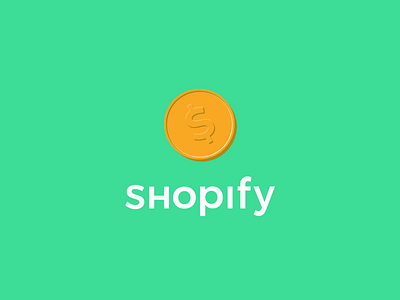
Shopify Logo Redesign
My Shopify logo redesign.
-----------------------------------
I have never liked the shopping bag logo that Shopify uses. I associate shopping bags with traditional brick-and-mortar retail (or at the very least customer-facing retail). So it has never been appropriate (in my head, at least) for an online B2B company and e-commerce platform like Shopify.
Inspired by digital currency, cryptocurrency, and arcade tokens, I redesigned the logo to better align with Shopify's brand image.
I used a flat design with a monochromatic color scheme to accentuate elevation and create an embossed effect. The "dollar sign" was inspired by the Portuguese "Cifrão" as it is a near-universal symbol for money and currency.
The lettermark is a modification of the type family Gothic, with a Medium typeface. The piece's proportions are 3x3 'S's from Shopify, and the lettermark is placed one 'S's distance below the symbol.
-----------------------------------
🦥 Follow me for more
📷 Instagram
🎨 Behance

