AMD Logo Redesign

My AMD logo redesign.
-----------------------------------
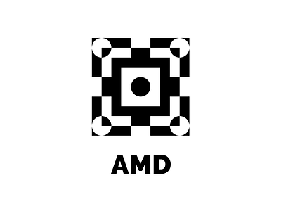
Inspired by microprocessors and computer chips, I redesigned AMD's logo into a more geometric design.
I incorporated the use of negative space into the symbol to mimic the complexity and beauty of microprocessors. Even so, the design remains scalable and recognizable at small sizes.
While harsh, the black and white color scheme is hypnotic and mesmerizing, drawing the eye inwards towards the center and giving the piece depth and perspective.
The type family used is Raleway, and the typeface is Black. The proportions of the piece are 5x5 'M's from AMD, and the lettermark is placed one 'M's distance below the symbol.
-----------------------------------
🦥 Follow me for more
📷 Instagram
🎨 Behance